Anyone else feel that US mass shootings have increased over the past few years? My wife thinks that it’s just availability heuristic at play. Well, luckily there is data out there that we can use to test it. This analysis in this blog uses the dataset from Mother Jones. I did some minor cleaning that you can see in the notebook.
Trigger Warning: This ended up being a pretty morbid post about mass shootings and fatalities.
I have been enjoying visualizations in Altair of late. Once you get accustomed to the declarative style, it’s hard to go back to matplotlib and seaborn. There are still some things that can’t easily be done in Altair and I had to fall back on seaborn and matplotlib. The map above and the plot below were done with Altair. Run your mouse over the bars in the chart above and select an area (and move it) on the scatter below for some fancy interactions. If you use an ad-blocker, the map may not load correctly. So pause it for the site and reload this page.
Ok. On to the analysis.
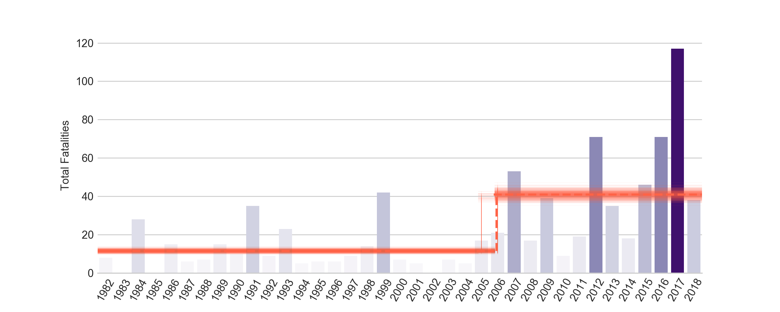
Number of fatalities
The bar chart under the map seems to suggest that fatalities have increased.
Coal mining disaster is the canonical example for bayesian change point analysis. What I do here is not that different. The model is as follows:
\[y \vert \tau, \lambda_1, \lambda_2 \sim Poisson(r_t)\\ r_t = \lambda_1 \,{\rm if}\, t < \tau \,{\rm else}\, \lambda_2 \,{\rm for}\, t \in [t_l, t_h]\\ \tau \sim DiscreteUniform(t_l, t_h)\\ \lambda_1 \sim Exp(a)\\ \lambda_2 \sim Exp(b)\\\](borrowed shamelessly from AM207)
We model the occurrence of a mass shooting fatality as a Poisson RV. At some discreter time, $\tau$, the rate parameter (or mean) of the Poisson RV changes from $\lambda_1$ to $\lambda_2$.
Modeling this in pymc3 is pretty simple and you can check the notebook for the implementation.
import pymc3 as pm
from pymc3.math import switch

with pm.Model() as us_mass_fatal:

    early_mean = pm.Exponential('early_mean', 1)
    late_mean = pm.Exponential('late_mean', 1)

    switchpoint = pm.DiscreteUniform('switchpoint', lower=0, upper=n_years)

    rate = switch(switchpoint >= np.arange(n_years), early_mean, late_mean)

    shootings = pm.Poisson('shootings', mu=rate, observed=fatality_data)
And this give us a switch point of 2006 (with a pretty tight hpd). The following plot shows a random 500 draws of switch points and the two rates. The rate changed substantially! And 2018 is not even half way done. Ugh.
Number of mass shootings
One thing that makes me uncomfortable with this analysis is that we are modeling fatalities as independent draws from a Poisson RV. But we know that is not the correct model for the ‘generating process’ (that sounds so callous, I’m sorry). The occurrence of a mass shooting can be modeled as independent draws from a Poisson and the number of fatalities per incident should be modeled separately.
Let’s just look at the number of mass shootings first. The code is the same as above.
import pymc3 as pm
from pymc3.math import switch

with pm.Model() as us_mass_sh:

    early_mean = pm.Exponential('early_mean', 1)
    late_mean = pm.Exponential('late_mean', 1)

    switchpoint = pm.DiscreteUniform('switchpoint', lower=0, upper=n_years)

    rate = switch(switchpoint >= np.arange(n_years), early_mean, late_mean)
    shootings = pm.Poisson('shootings', mu=rate, observed=shootings_data)
The switch point in this case is not so clear cut. The histogram of the sample draws for posterior $\tau$ is bimodal.
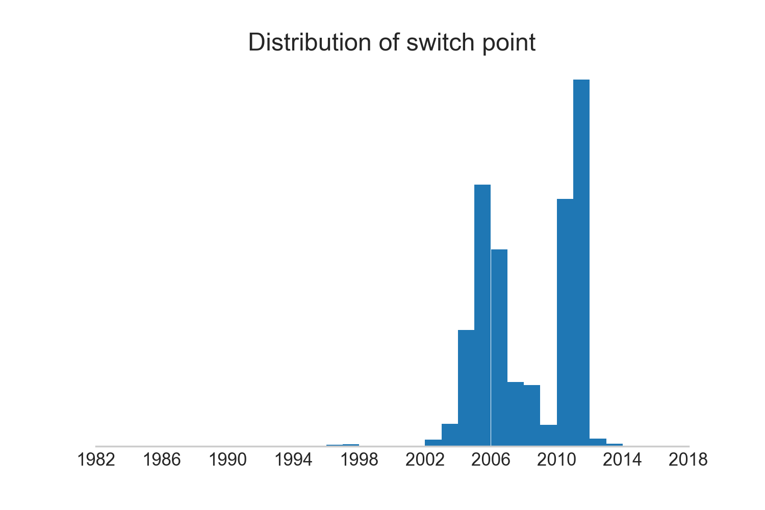
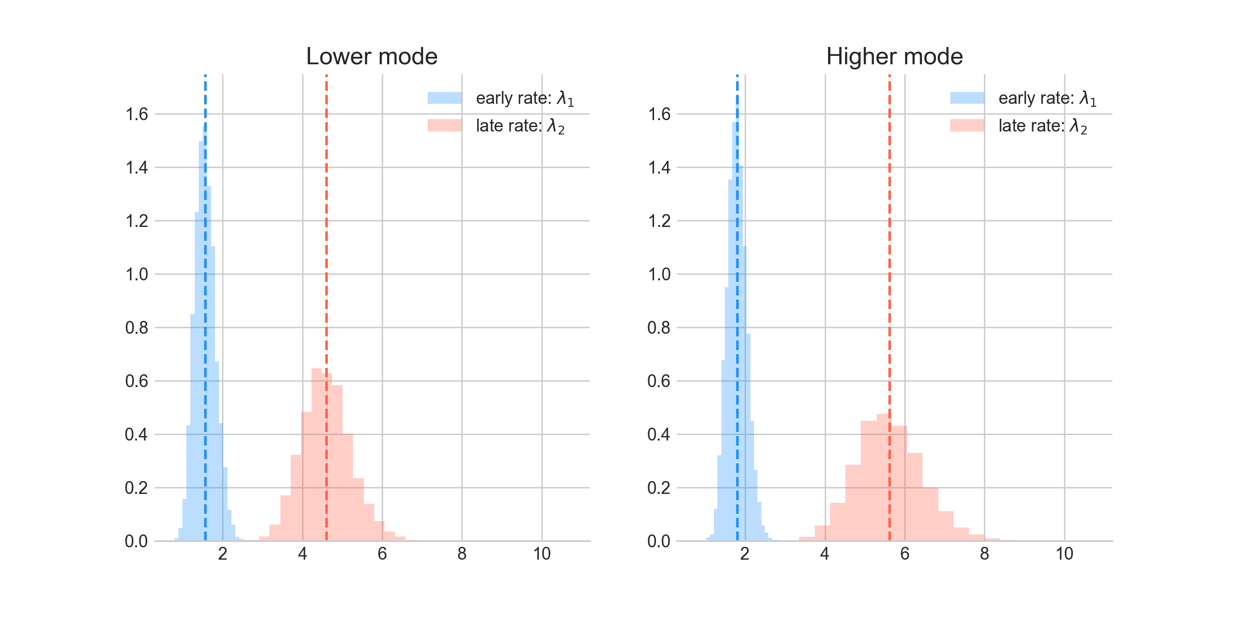
Let’s look at these separately; we’ll consider the values of $\lambda_1$ and $\lambda_2$ in the two modes.
The chart below shows the associated posteriors for the lambdas in the two modes. Though there is substantial overlap, $\lambda_1$ seems similar in the two modes while $\lambda_2$ is more different.
The plot below makes it a little clearer. So, we have two most probable switch points (we’re considering the top two modes - though we have an entire distribution of switch points). $\lambda_2$ (or the late rate) is lower for the switch point around 2006 (in red) compared to the one for the switch point around 2011.
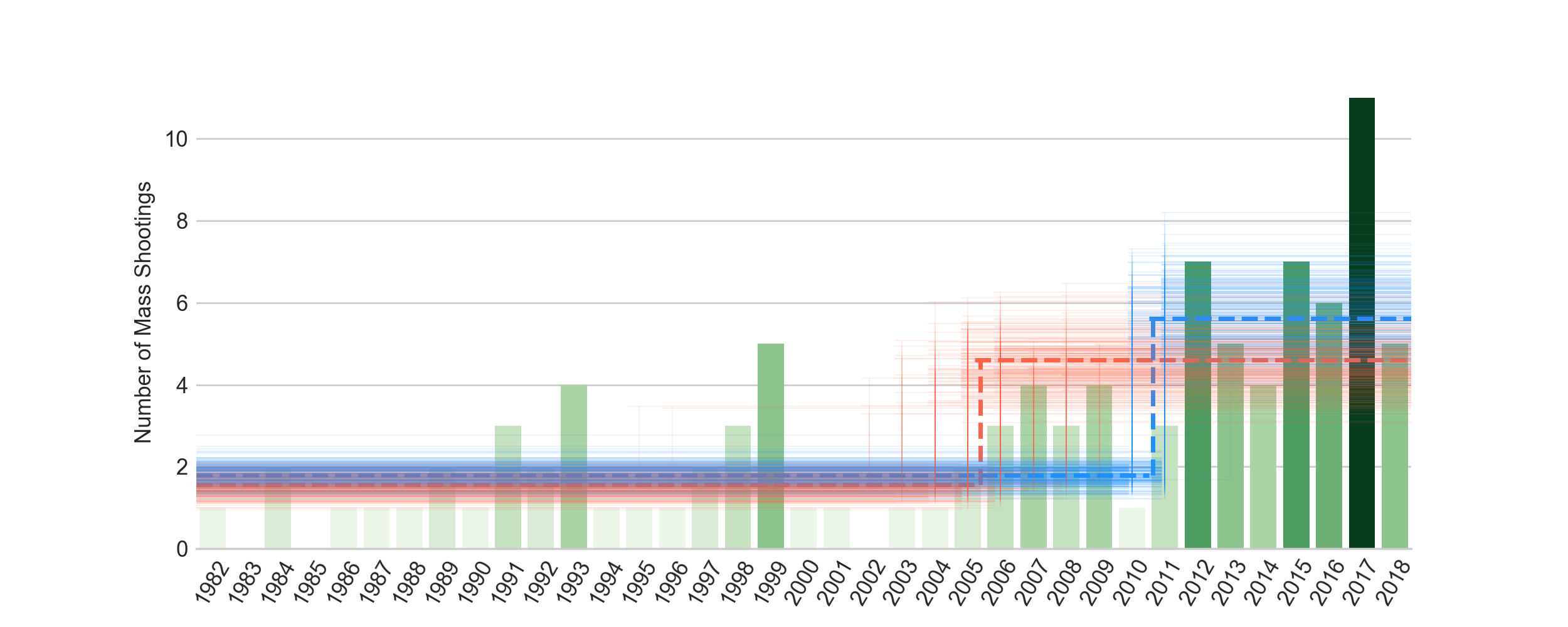
Something happened in 2006 (or 2011)
Note that in either case, the distribution of $\lambda_1$ and $\lambda_2$ have barely any common support. The rate definitely went up recently. We can argue if it was around 2006 or 2011.
So what happened around here? Number of guns go up? New legislation? Did Mother Jones just hire a more diligent data collector?
Next up: Rate of fatalities
What about the rate of fatalities i.e. how many die per mass shooting? Has that increased over the years?
There are a few models to compare:
- It’s a year effect: More people are killed every year (maybe due to easier access to higher powered guns).
- It’s a venue effect: More people are killed because of WHERE the shootings take place. Some venues just lead to larger number of deaths and that’s where the shootings are now occurring.
- It’s a bit of both: There is a year trend and a venue effect.
And in many of these cases, we can have a fully pooled or a partially pooled model. I’ll do a separate post for this and properly compare these models.