I recently had to create a bunch of maps for work. I did a bunch in d3.js a while back for India for CEA’s office and some (in non-interactive form) were included in the Indian Economic Survey.
Though the code can be a little longer and you’re converting shapes files to geojson before rendering them, d3.js has so much community support for mapping that it wasn’t too hard to learn.
I tried to do it in python and it wasn’t as flexible. At least, given the amount of time I was willing to dedicate to it. I did eventually figure it out. Here’s my code with some explanations. There are better ways to do it - plotly, geoviews/holoviews, bokeh to name a few. I’ll do another blog once I’ve got them working.
You can get the actual notebook here.
Setup
If you are coming fresh, there is a bit of work to setup your environment and the files in order to do the maps.
Packages
Here’s the incantation to load all the necessary spells:
import pandas as pd
import numpy as np
import matplotlib.pyplot as plt
import matplotlib as mpl
import seaborn as sns
import geopandas as gpd
import shapely as shp
from shapely.geometry import Point
You can use ‘pip’ or ‘conda’ to install them.
I wish I had started writing this as sooner. I struggled for almost half a day getting ‘fiona’ and ‘shapely’ to play nice but now can barely remember the things I tried. A few things I do remember:
- Do a ‘conda update -all’ to start off and often. Fixed library issues with ‘fiona’ install.
- ‘conda’ complained if you install ‘shapely’ and ‘fiona’. I just installed one of them with ‘pip’.
Good luck. If you get an error, drop me an email with it - it might jog my memory.
Get your shape files
If you don’t have one already, go to Global Administrative Areas and download the shape file you want. We’ll work with Turkey here mainly because it is small and has delicious food. On macOS/*nix:
> wget http://biogeo.ucdavis.edu/data/gadm2.8/gdb/TUR_adm_gdb.zip
> unzip TUR_adm_gdb.zip
Prep your dataset
You need a way to get latitude/longitude data for your geographic area. You could use google maps or nominatim or other geolookup api to get it. I used geonames to get a location for my postcode data.
Let’s start assuming you have this data in dolma_df. I’ve just jumbled up some real data for this demo and will claim that it has the kilos of Turkish dolma sold in each postcode.
Let’s convert the lat/long fields into a ‘shapely.geometry.Point’ and convert it to a geopandas dataframe:
dolma_df['coordinates'] = dolma_df[['latitude','longitude']].apply(lambda x: Point(x[1], x[0]), axis=1)
dolma_gpd = gpd.GeoDataFrame(dolma_df, geometry=dolma_df.coordinates)
Load up your shape file and do a spatial join with your geopandas dataframe. For each of the shapes (sub-regions) in the shape file, geopandas checks if it contains the coordinates in our data. Check out other types of spatial joins. Note that we are keeping ‘left’, so only the records from our data that can be mapped are included. A good check here is to see what percentage didn’t make it.
geo_df = gpd.read_file(SHP_FILEPATH + "/BGR/BGR_adm2.shp")
gdf = gpd.sjoin(geo_df, dolma_gpd, op='contains', how='left')
That’s it. Our dataset is ready.
Change your projection (OPTIONAL)
GADM data uses the WGS84 latitude-longitude projection. If this is not what you want, you can switch to Mercator (or another appropriate one) by running:
gdf.crs = {'init' :'epsg:3395'}Depending on how big your dataset is, this can be quite slow.
P.S: If you find a nice listing of all popular projections to their epsg codes, please drop me an email. The universe will reward you with good coding karma.
Let’s make those maps
But first, more setup
We want to collapse the field of interest, in my case, data to the level in the hierarchy we’re interested in. So here I’m collapsing down to ID_2 which is a level under state boundaries (‘ID_1’). But I want to keep the rest of the columns unsummarized (ha! that’s word).
gpd_joined_gby = gdf.groupby(["ID_0", "ID_1", "ID_2"])[["num_dolma"]].sum().reset_index()
gpd_joined_unique = gdf.drop_duplicates(subset = ["ID_0", "ID_1", "ID_2"]).drop("num_dolma", 1)
gpd_joined_gby = gpd_joined_unique.merge(gpd_joined_gby, on = ["ID_0", "ID_1", "ID_2"])
Get the rough shape of the plot
Countries come in all shapes and sizes. To make sure we don’t end up with a tonne of whitespace, let’s get the rough shape our plot should have.
xmin = gpd_joined_gby.bounds.minx.min()
xmax = gpd_joined_gby.bounds.maxx.max()

ymin = gpd_joined_gby.bounds.miny.min()
ymax = gpd_joined_gby.bounds.maxy.max()

xscale = 20      # (1)
yscale = (ymax - ymin) * xscale / (xmax - xmin)
You may want to tweak xscale above. 20 is probably too big for Russia but not big enough for Surinam.
Get the scale of our data
dolma_max = np.ceil(gpd_joined_gby.num_dolma.max())
dolma_min = np.floor(gpd_joined_gby.num_dolma.min())
What you might also want to do is transform this data so it’s on a scale that makes sense. In my real analysis, I took a log of the data.
Let’s actually do the plot
What I like to do is to create three subplots. One for the actual figure, one for the header, and one of the scale. Note that you can use this framework to make numerous subplots that all share the scale and arrange nicely (this is what actually prompted me to set it up this way)
buffer = 0.05        # the space between the subplot
xomit = 0.07         # for the scale
yomit = 0.07         # for the header

xmax = 1 - xomit
ymax = 1 - yomit

xwidth = xmax
ywidth = ymax

dims = []
dims.append([buffer, buffer, xmax - buffer, ymax - buffer]) # Actual plot
dims.append([xmax, buffer + (ymax - 0.5)/2, xomit - buffer, 0.5 ]) # For the scale
dims.append([buffer, ymax + buffer/2 , xmax - buffer, yomit - buffer]) # For the title
We now have dimensions for each of the subplots. I turned this into a function that allows for arbitrary number of subplots of equal size and adds the title and scale subplots to it.
f = plt.figure(figsize=(xscale, yscale))
ax = plt.axes(dims[0])
gpd_joined_gby.plot(column = 'num_dolma', cmap = "RdBu_r", vmin = dolma_min, vmax = dolma_max, legend = False, figsize=(xscale,yscale),
                         linewidth = 0.5, edgecolor='black', ax = ax)
ax.axis("off")
Add the color bar for scale
Notice that I turned legend off in the previous block. You can turn it on and see what you get. It wasn’t pretty enough for me so I decided to manually do it
cax = plt.axes(dims[-2])
cmap = mpl.cm.RdBu_r
norm = mpl.colors.Normalize(vmin=spend_min, vmax = spend_max)
cb1 = mpl.colorbar.ColorbarBase(cax, cmap=cmap,
                                norm=norm,
                                orientation='vertical')
cb1.set_label("dolma sales (kg)")
Add a title
Add a title to the subplot reserved for it. There are other ways to do this - f.suptitle() etc. but this gives me a lot of control.
ax = plt.axes(dims[-1])
ax.annotate(title, xy = (0.5, 0.5), ha="center", va="center", fontsize = 24)
ax.axis("off")
Let’s check out our masterpiece
plt.show()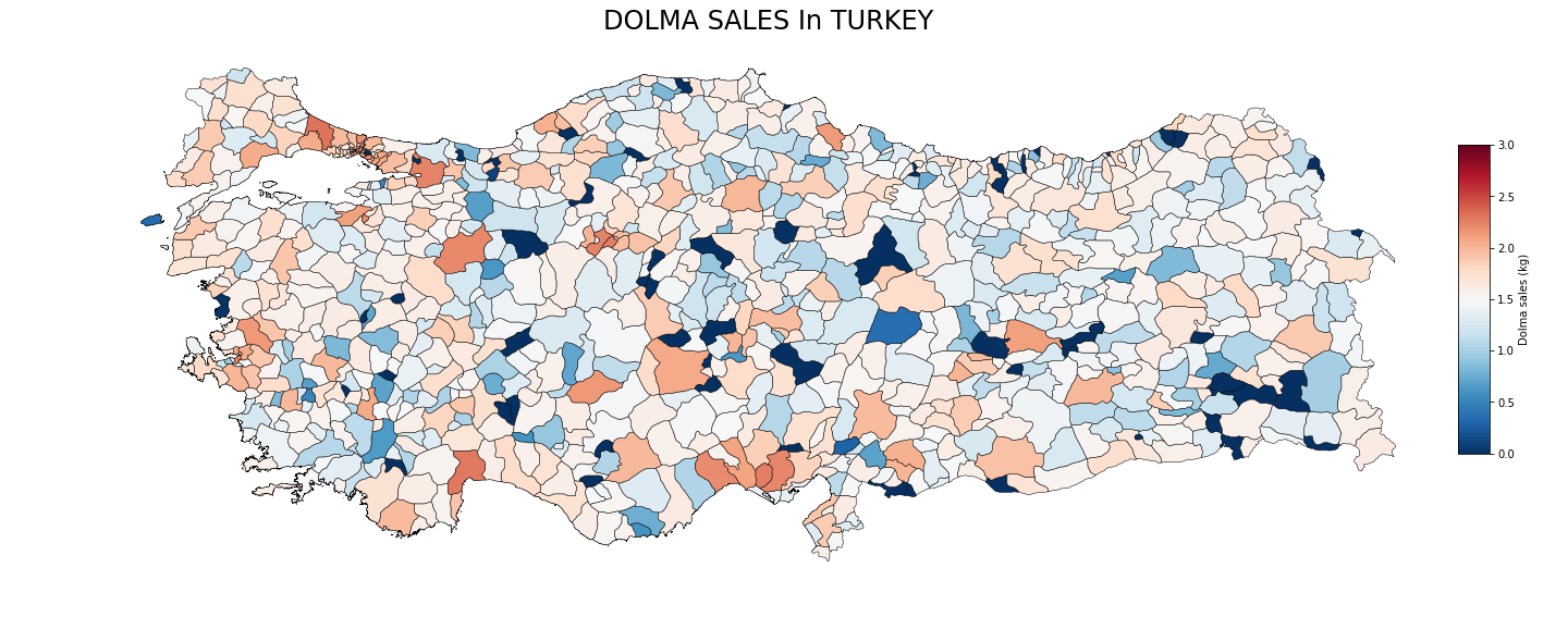
Not bad for not a tonne of work. You can get the actual notebook here.
If your map looks a little skewed, I’d go back and play around with your projections and find one that makes sense. Ok hack at it by playing with xscale and yscale.